Your SpreadShop is about to become more beautiful, more customer-friendly and faster. A completely revised list page is about to come to life, and that’s where you come in! We need you to tell us what’s hot and what’s not, so please take part in out beta test and make your opinion count. You’ll be first in line to see and test your Shop in its brand-new guise.
You can now access the beta (test) version of your Shop by replacing the URL element “shop” in front of .spreadshirt with “shopbeta” (i.e. shopbeta.spreadshirt.co.uk/SpreadShop).
Please leave any feedback in the comment section below.
For the whole month of February, you can try out the beta version. We’re planning to release a revamped Shop view in the beginning of March.
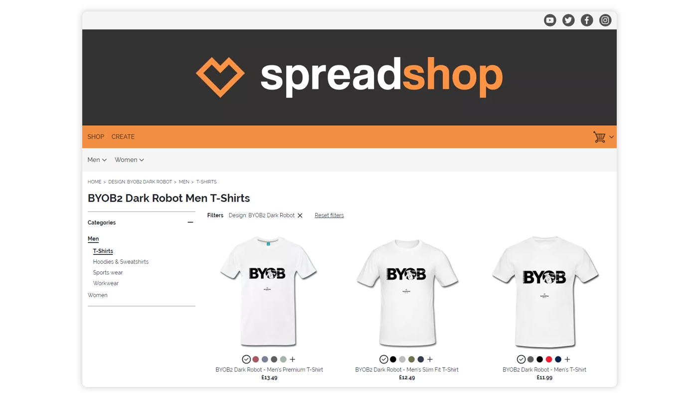
Some of the improvements include:
- Better performance and shorter loading times
- Relevant search results and less empty searches/error pages
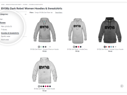
- The size and colors options are visible under each product
- Size and colors can be filtered from list page (introduction likely coming after the beta test)
- Easy navigation thanks to Breadcrumbs
- Improved ranking on Google and other search engines thanks to upgraded meta data and schema.org support
- Social media integration with Open Graph protocols
- Intuitive filtering on mobile devices
Shop Partner with your own CSS?
We’re defining completely new CSS classes for the new list-page version, and it’s already in place in the beta version. Now, you can define separate “HTML & CSS“ styles in the CSS field of your extended Shop Settings, both for the current version and the beta version.
These new definitions may not work with your current CSS on the beta version’s list page. In this case, they will also not work in the upcoming version after the release. This may necessitate adjusting your layout ideas to the new classes.
Of course, we’ll respond to feedback and suggestions as we continue to improve the system throughout the beta phase. This means that the beta version may receive another overhaul by the time it goes live.
We’ll only be implementing changes through the first half of the month. To give you a chance to adopt to the changes, we’ll only do dramatic HTML and CSS changes in exceptional cases in the second half of the month. Otherwise, you’ll see relatively minor revamps during the latter half of February.
Shops tied in with JavaScript
Embedding with JavaScript is also possible with the beta version. Just create a new page in your webspace and copy over the embedded code. Now change the JavaScript code from shop.spreadshirt to shopbeta.spreadshirt so that the beta version is completely embedded.
What’s next?
The new list page is a milestone on the path to the perfect SpreadShop. We’ll keep improving the list page after the next release in early March, including improved filtering of colors and sizes.
What’s more, we’re already tackling the next challenge! Keep an eye out for a completely revised detail page that will be introduced with a future beta version.
Feedback on the list page will help us help you. Please drop any comments below! And thanks! ?




Non è cambiato nulla da come mi sembrava annunciato. a parte il fatto che I prezzi sono sovrapposti al titolo delle maglie.
Mi sembrava di ricordare che le sezioni nella versione beta dovevano essere al lato sx invece sono sempre sopra.
Can you send me your shop URL please, so I can check?
Thanks,
Lena
With every product I fill in the description, I can’t find it anywhere when I select that design in the shop.
Hi ABCartoons,
What do you mean exactly? Can you please let me know your shopID so I can have a look? It probably comes back to the view you have chosen in your account. If you give me some more information I can have a look.
Thanks,
Lena
Sarebbe bello inserire nella sezione accessori anche occhiali da sole….. comunque spread shirt il meglio?????
Thanks for your feedback. We won’t be able to add sunglasses to our product range any time soon I’m afraid as these require a new printing technique/machines.
Looks great. Thanks
You wanted comments, so here goes…
I see some have reported on the black background-color. I have that too, not in the front window, but when you select an item to select size and/or color.
AND I think it looks a bit messy having both the bar-menu (Home-ikon, Men, Women, etc)
and having the same menu down the side of the window/screen. Better to have one or the other, but maybe there will be an option in setting up the store??
BUT having the different colors show underneath each t-shirt is very nice, love that. And I guess there will be some changes in the options in setting up the store that I will welcome very much.
Keep up the good work!
Dit ziet er super uit
Good job but parteners still needs to choose colors and products.
Please let us this possibility.
I like it!
I like it! 🙂 works – and looks perfectly!
hey lena,
take a look at https://shopbeta.spreadshirt.de/memeshirtsde -> click on any design -> the previews within the new url do have a black background, png wise. on the regular site (not beta), everything works fine.
greetings 🙂
Right, can reproduce it now and it has been forwarded 🙂
with my store, everything worked fine.
love the new update. keep up the good work!
Amazing!!! Thank you spreadshirt ^_^
Much better!
Nicr
my pictures all have a black background now…
I cannot reproduce that :-/ I see the background colour of the product each design is on.
Or what should I click on exactly to reproduce the behavior you’re mentioning?