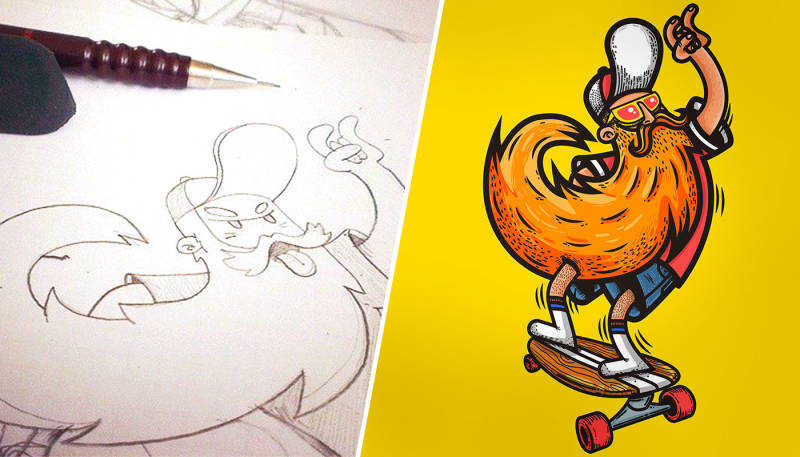
Spreadshirt artist Redwane has been one of our community’s most successful designers for years— all the more reason to get excited when he provides insight into the creative process of his art. Here’s a pic-by-pic tutorial of his Hipster Skater design, all the way from the first sketch to the polished result.
You never know how or when inspiration will strike. A white sheet of paper or a blank page in a sketchbook tends to be the canvas where fresh ideas first materialise. Before the creative avalanche begins to rumble down the mountain, a small sketch – with all of its imperfections – often serves as the springboard for bigger things to come.
Once an idea has taken its first shape on paper, I only need to scan it or take a picture with my phone to import it to Adobe Illustrator. I then use the pen tool to bring out the basic lines.
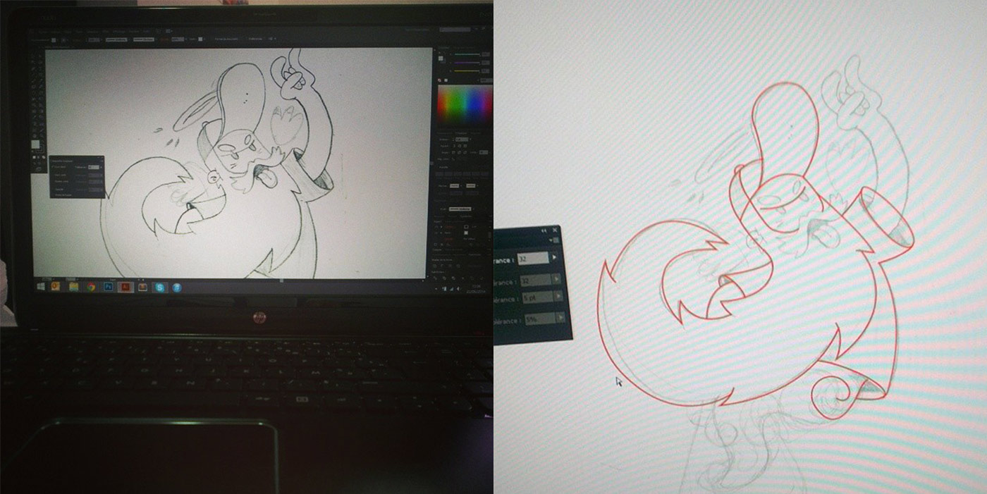
After vectorising the drawing, I add the details. Here it’s the eyes, shadows, halo, beard and a bit of a shine. I work with the mouse, but when it comes to adding small dots and lines for decorative purposes, I use a digital drawing board. I like Wacom’s tablet. I don’t use specific parameters, just the stylus pen to control the sensitivity of the line thickness.
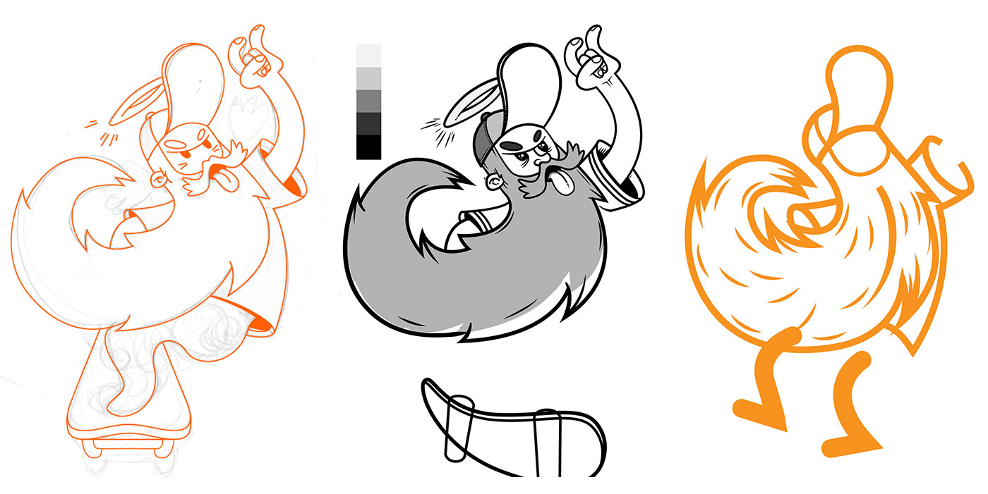
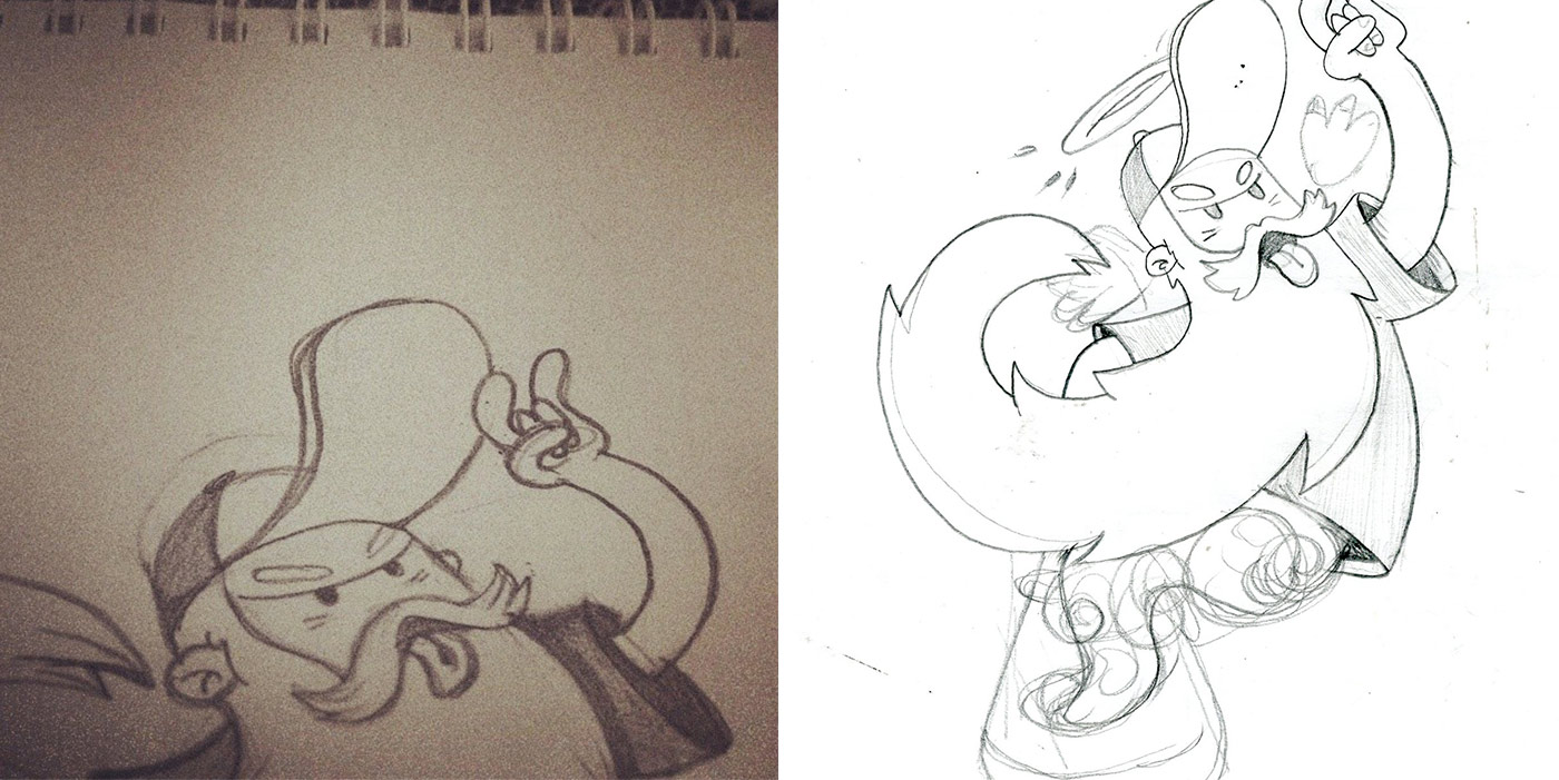
In the process of drawing, I often realise that the result doesn’t meet my ambitions. That’s when I revert a few steps to find a different way just as with the legs of my old skater and his board.
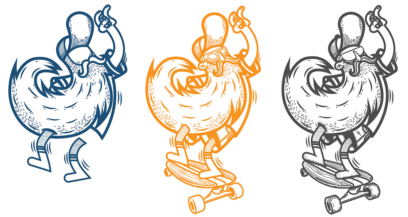
A little trick to always keep track of your work is to regularly duplicate the result of an accomplished step in the process. This way, you can go back to an intermediate step to start over again. As soon as I’m happy with the general alignment, I start working on the details. The more details you add, the more the overall look of the design changes. Details lend character to the design.
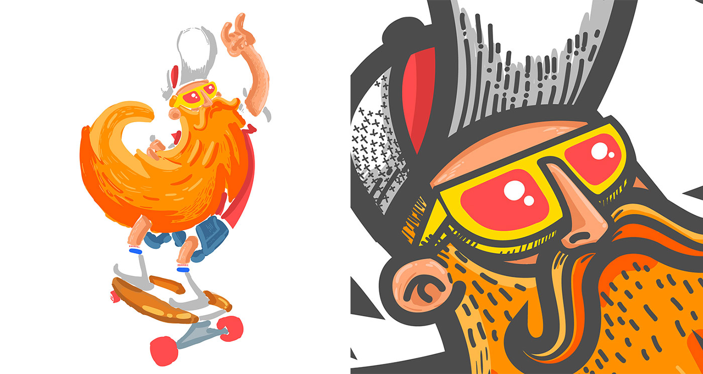
As for colouring, the procedure is always the same: I set out by choosing colours for the main areas and then and continue with shadows. My personal rule here is to limit the number of colours to as few as possible and as many as necessary. This helps when keeping colour limitations for certain T-shirt printing techniques in mind. In the end, I bring out the highlights.
I add a different layer for every new colour, as it’s nice and handy to work on individual colours without having to redo everything.
I like to vectorise my drawings, and that’s why I finalise all the work with Illustrator. I rarely use Photoshop. As for the number of colours, I avoid colour gradients for technical reasons. In my example, I’ve used more than 3 colours which meant I wouldn’t be able to upload it as a vector graphics file but had to convert it to .png with a transparent background.

Thank you again, Redwane, for all the insight you provided. Best of luck, and we look forward to seeing your future designs. And follow Redwane on Twitter!