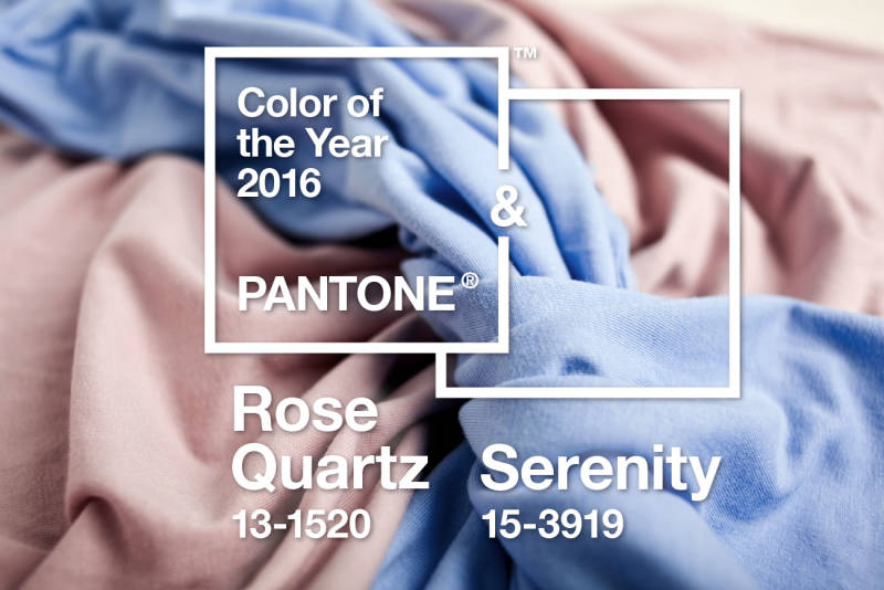
Halfway between burgundy and brown, Marsala was propelled to the forefront of fashion in 2015. The Pantone trend gurus have now – for the first time – elected two new colours to wow the scene in 2016. The pastel colors that won the race are Rose Quartz and Blue Serenity, and they are bound to rule the waves of trend this year.
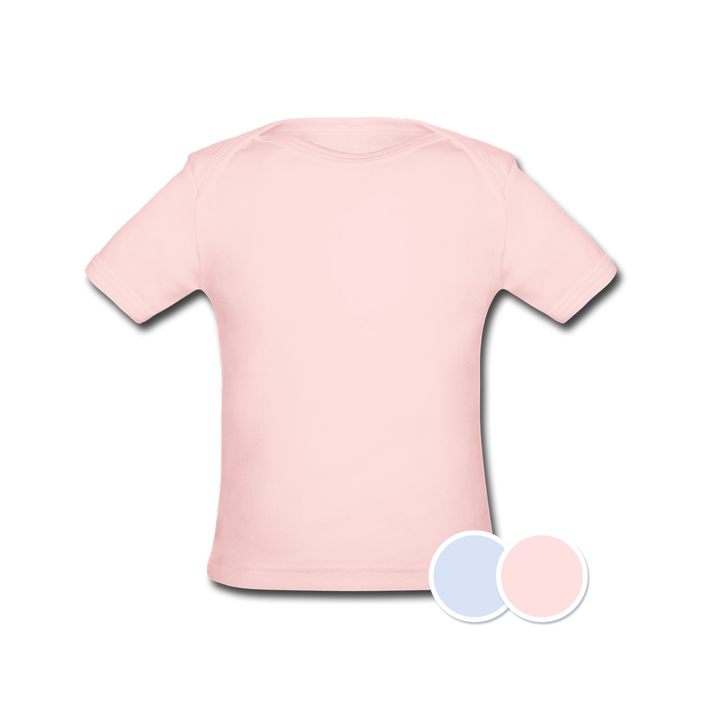
Rose Quartz and Blue Serenity
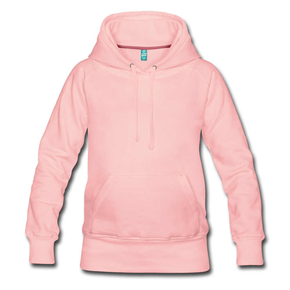
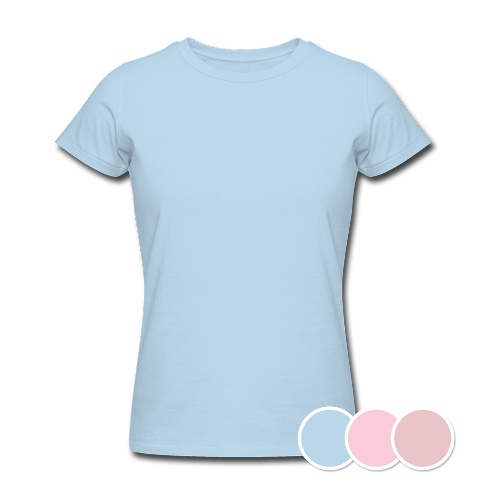
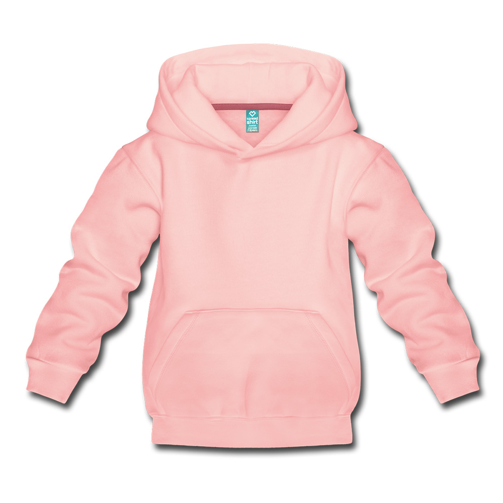
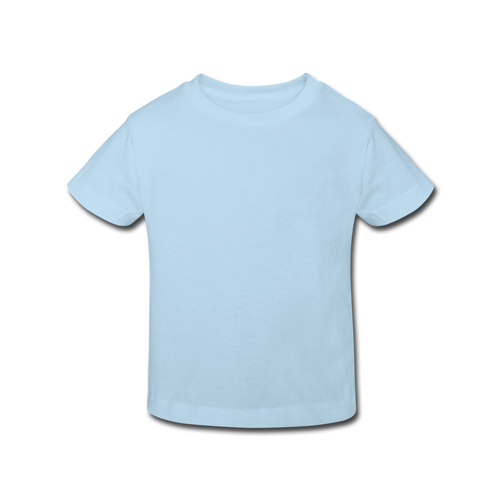
You could just call them sky blue and light pink, but these very distinct nuances are well deserving of their nice and colourful names. As the name suggests, Serenity exudes a very calm blue, and Rose Quartz the flowery essence of a pastel shade of red. The two colors are a perfect match as well, even more so since they embody a brilliant symbiosis of wellbeing, peace and balance.
New and Trendy Threads
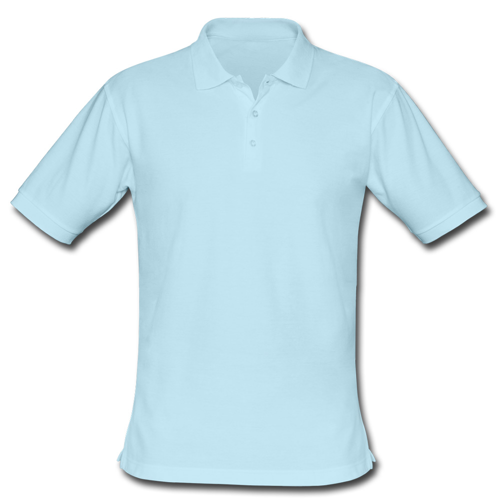
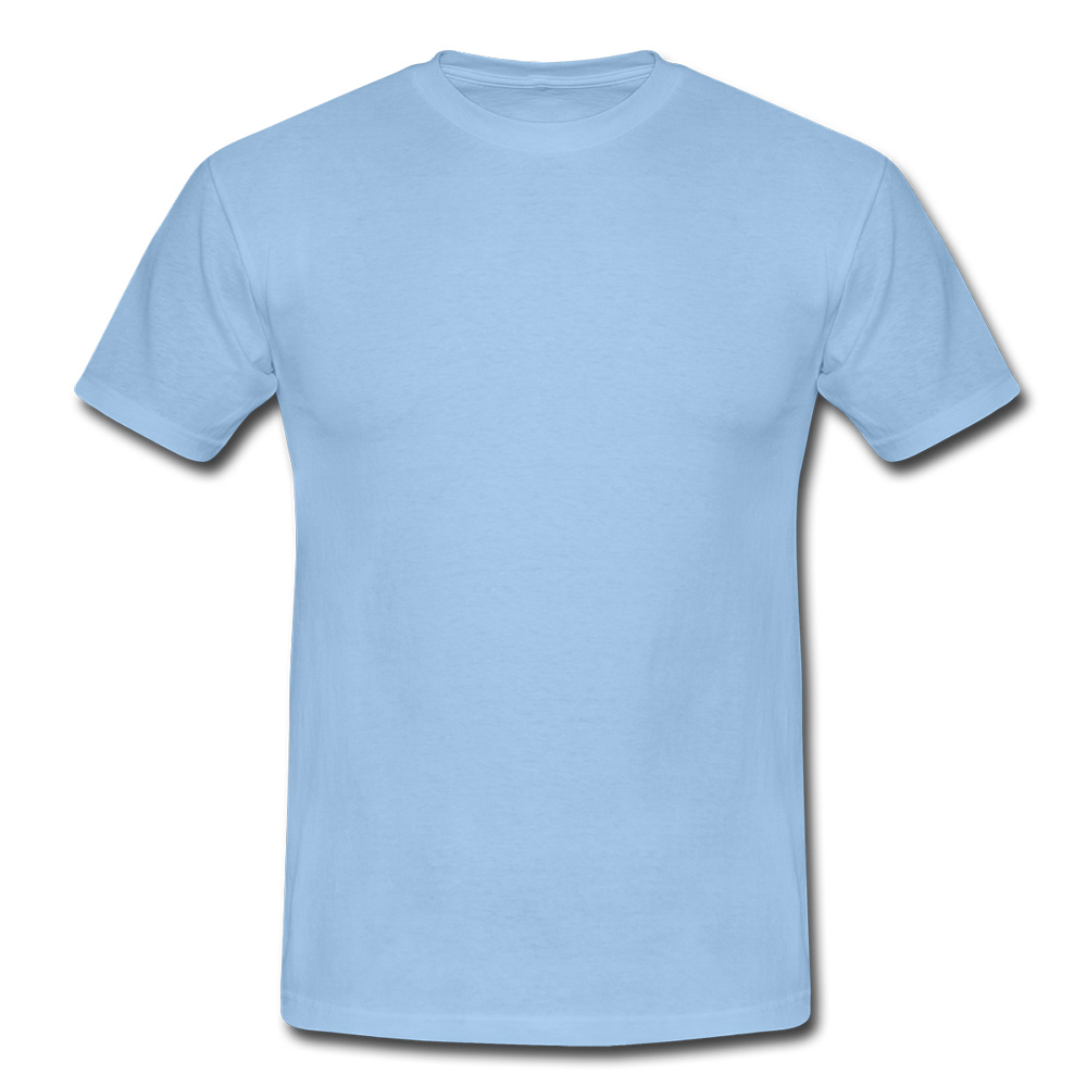
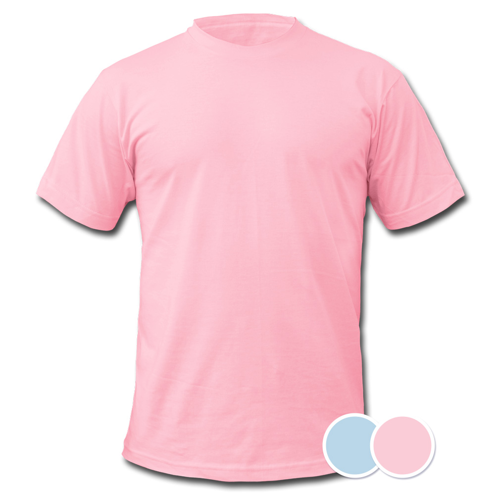
To get a better idea of what the colours look like in the flesh, we have put together a selection from Spreadshirt’s product range these colors. Get inspired by the possibilities of colour co-ordination that Rose Quartz and Serenity offer.
Men
Women
Kids
What do you make of the colours of the year 2016? Do you like the colour co-ordination of these two pastel shades? Please do let us know in the comments below!


Hello KEIN DESIGN,
thanks for your comment! We´re always testing new colours and products and as soon as we decided to include new articles on our platform, I´m going to inform you all via our partner newsletter.
Cheers,
Leila from Spreadshirt
It is pity that there is you are not able to cover these colors with your premium T-shirt selection.
I hope that the introduction is in consideration.
Cheers,
KEIN DESIGN