
You can now access the beta (test) version of your Shop by replacing the URL element shop with shopbeta in front of .spreadshirt (i.e. shopbeta.spreadshirt.de/SpreadShop).
Please leave any feedback in the comment section below.
Until the end of March, you can try out the beta version of the page. We’re planning to release a revamped Shop in the beginning of April.
Some of the improvements include:
- An alluring new layout
- Improved performance and shorter loading times
- Optimization for mobile users
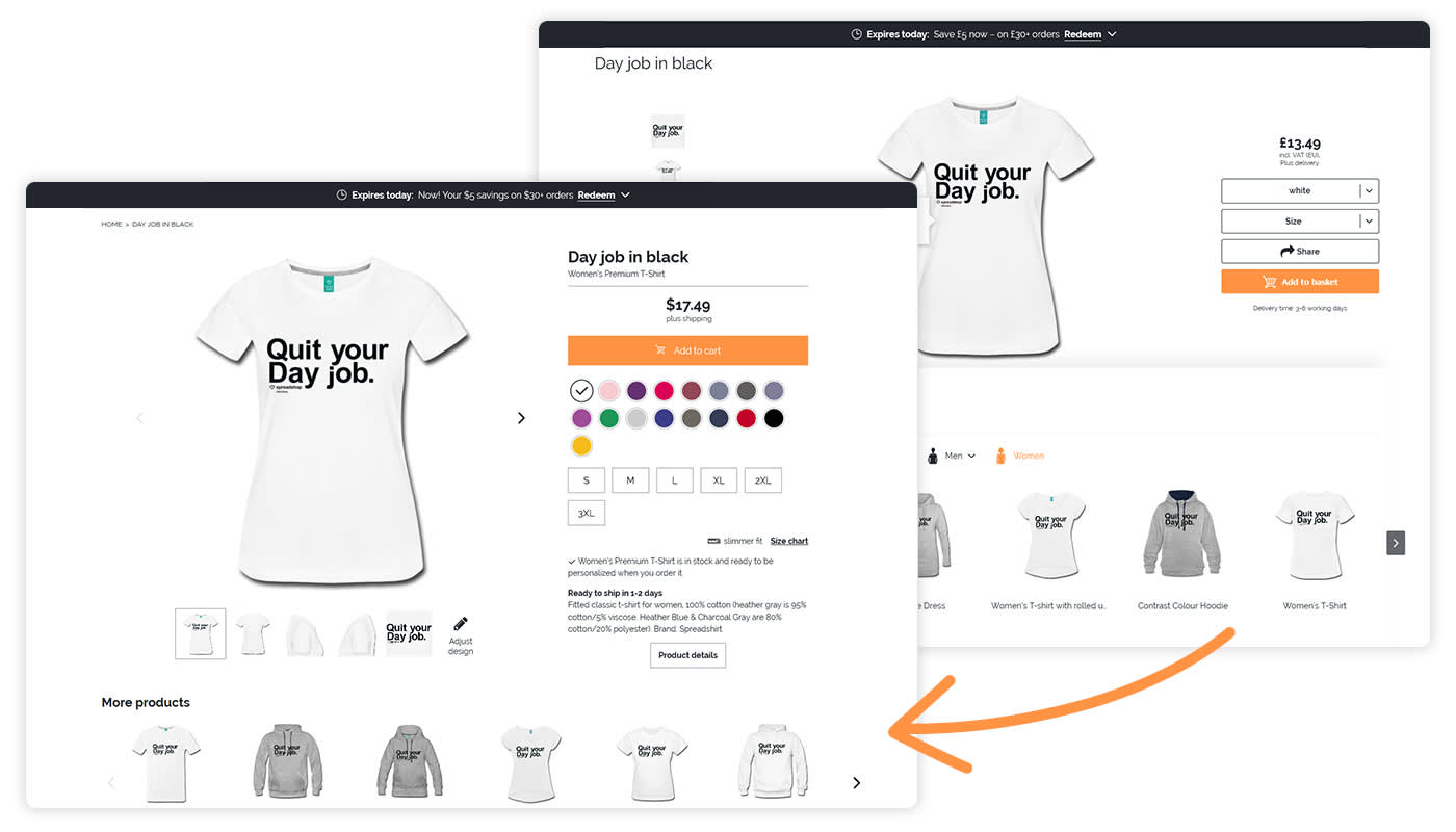
- A single version of the detail page (instead of the current two-option layout)
- Improved ranking on Google and other search engines thanks to upgraded meta data and schema.org support
- Social media integration with Open Graph protocols
Shop Owner with your own CSS?
We’re defining completely new CSS classes for the new detail page, and they’re already in place in the beta version. Now, you can define separate “HTML & CSS“ styles in the CSS field of your extended Shop settings, both for the current version and the beta version.
These new definitions may not work with your current CSS on the beta version’s detail page. In this case, they will also not work in the upcoming version of the page. This may require you to adjust your layout ideas to the new classes.
Of course, throughout the beta phase, we’ll respond to feedback and suggestions as we continue to improve the system. This means that the beta version may receive another overhaul by the time it goes live.
Shops tied in with JavaScript
Embedding with JavaScript is also possible with the beta version. Just create a new page in your webspace and copy over the embedded code. SImply change the JavaScript code from shop.spreadshirt to shopbeta.spreadshirt so that the beta version is completely embedded.
What’s next?
The new detail page will be released in the beginning of April. What’s more, we’re already tackling the next challenge. We’ll be adding the ability to choose model images and include products’ ekomi ratings in further iterations of this page! Also, keep an eye out for shop collections and cool, new features to easily market your products via Facebook.
Feedback on the detail page will help us help you. Please drop any comments below! Thanks!


Nice new layout of the details page.
I too think the “add to cart” button should be moved.
Will there be a feedback system for customers in the future?
For feedback you can use our Forum: https://www.spreadshirt.net/forum/c/english
Overall the design looks better. I especially like the more graphical customisation of colours which makes that more apparent to someone as soon as they land on the page.
I do agree with other commenters that the “add to cart” button needs to be below the other stuff – it’s where people look for the Call To Action once they’ve checked and/or built their options up.
Thanks Phill for your feedback. Having placed the button above the sizes and colours is indeed intentional. This allows for the CTA to be always above the fold on mobile devices. We think the flow is still OK; Because the issue with the size not being selected is occuring anyway. But we also have tracking on this and will be monitoring it closely.
The shirt description is missing, is this intentional?
Yes it is but this has to do with the way our products are set up in the new partner area (you are probably using the old user area). There you describe the design and add tags to that design. You cannot describe each product individually.
Yes, that’s right, I am using the old one. Kinda used to it 🙂
Hi. I think it’s an OK page, but there is one weird thing. The “add to cart” button is ABOVE the customization. This is weird for me, because it’s not a natural flow: select color, go down, select size, go up, go up, add to cart..
I think the old placement of the button was better.
The layout of the new one, for the rest, is great 🙂
You’re not the first one to mention this and it caused also a lot of discussion in the team. Therefore, thanks a lot for your feedback – we very much appreciate it 🙂
Very nice, but when will we see changes to the color range, product range (instead of groups) and print range. (able to print both sides of shirts)
I receive a lot of negative feedback on those 3 things. Shops will look more professional if the shopowner has the ability to control these ranges.
Thanks Arie for your feedback. We’re working on the above mentioned issues. You will gain more control over your products in the next three months.
Thank you Lena, that is good news! Looking forward to the next 3 months.