Sit back, grab a snack, and discover the magic of wild 70’s design styles.
The 70s … the epoch of flower children, demonstrations and bell-bottoms. The influences of this era can still be felt today and keeps inspiring designers with timeless classics. Bright colors, psychedelic patterns, playful typography and retro-futuristic elements lovingly push the nostalgia button. Looking for inspiration for your designs or yourself? Just want to take a little aesthetic trip back in time? This dynamic and exciting chapter in graphic design history will be happy to take you along for the ride.
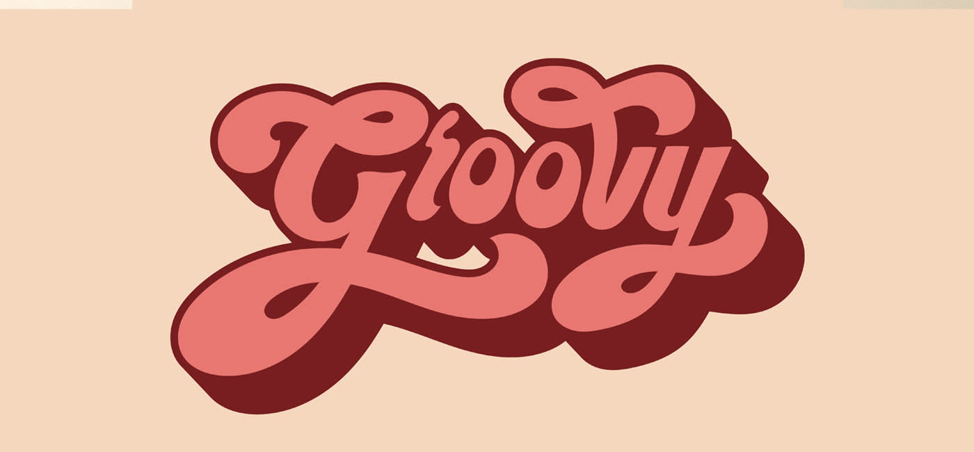
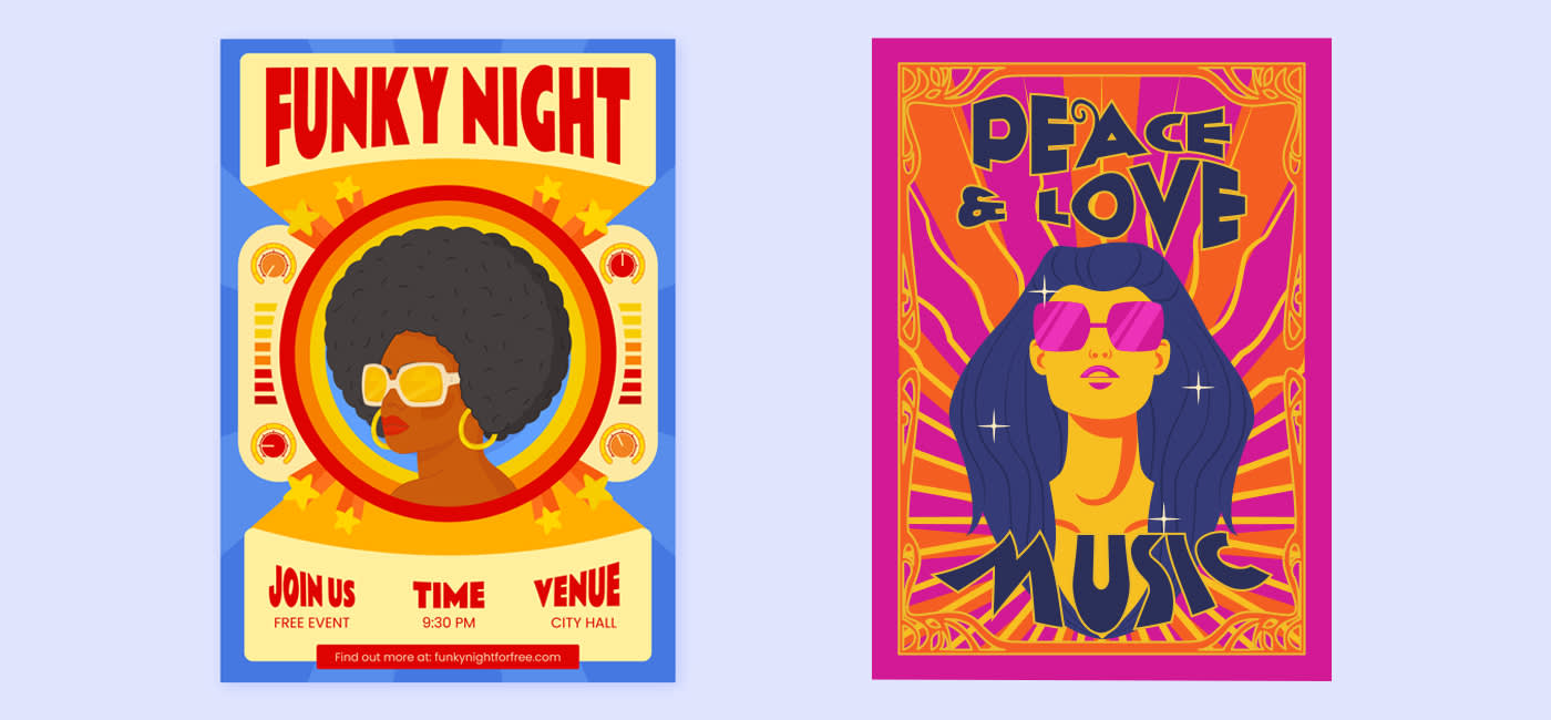
One style, one word: GROOVY
Groovy is the word of the 70s. It was used mainly to describe something particularly casual or unusual. Depending on the context, it can also mean excellent, modern or remarkable. Everything that attracts attention can be found in this little word. And it fits perfectly with the spirit of the times and its designs. Countercultural movements and revolutions found expression in bright colors, psychedelic aesthetics and free-spirited typography. Representatives of the hippie and youth culture put “groovy” in their mouths, as it stands for freedom, individuality and non-conformity. The designs of the 70s reflect this cultural change in their very own groovy way.
The 70s: a brief history of design
In the 70s, the Internet and everything digital that we take for granted today was still decades away. Graphic designs were mostly created manually and with a fair amount of experimentation. The commercial usability of graphics and illustrations was not yet a primary concern. Different media and elements such as photographs, fonts, floral patterns and people became a colorful remix. In general, the designs of the 70s were still much more influenced by natural occurrences like flowers, mushrooms, sunsets and clouds. In their early days, the 1970s still reflected the psychedelic touch of the 60s – including the rock and pop music of the time. But cultural change slowly made itself felt with the technical innovations of the time: portable tape recorders, the first digital watches, and Apple’s first computer. In the field of typography, graphic designers took the liberty of working with organic shapes, patterns and fonts. The fact that the typefaces often resemble the bubbles of a lava lamp is typical of this era.
Come in peace: design elements of the 70s
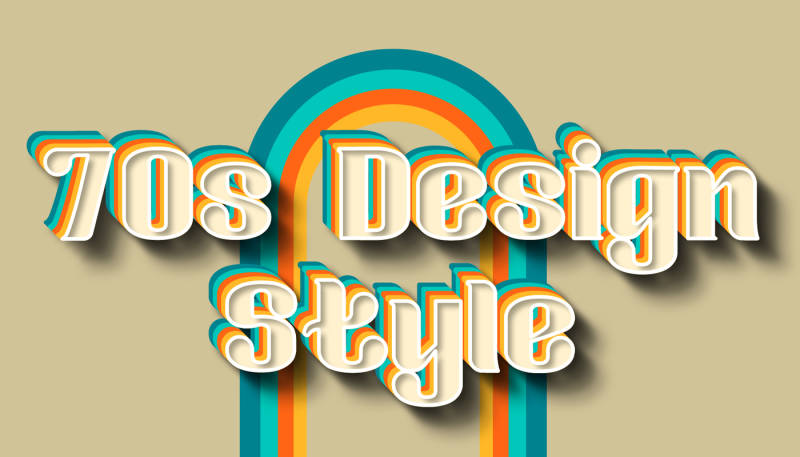
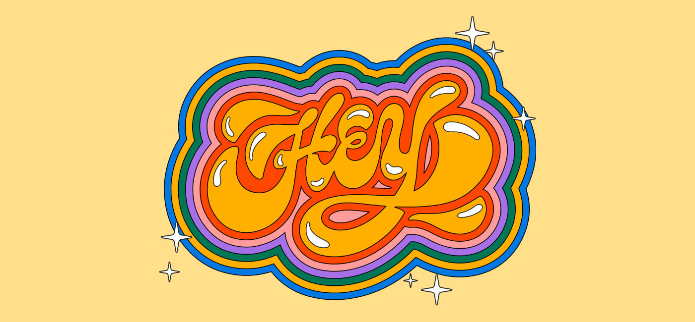
1. Free-form typography
New technical possibilities ensured that designers were able to exert far more influence on typographic design. A first iconic innovation was swirling curves on individual letters. They drew the viewer’s attention directly to the typeface and had an interesting, lively effect. Bubble fonts were another special feature of the 70s. In keeping with the era, they conveyed a light, playful mood. And then there were the so-called disco fonts. Inspired by nightlife, bright neon lights and endless parties, these fonts in capital letters caused quite a stir.
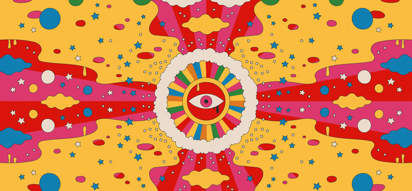
2. Psychedelic patterns
Influenced by the psychedelic movement of the 60s, 70s design was characterized by intricate patterns, shape in swirls, and abstract compositions. Noisy, geometric shapes were especially popular and left a deep visual impression: they were unpredictable, mind-bending and unconventional. The intricate patterns, bright colors, and abstract shapes of these designs conveyed a sense of grooviness (“that’s so groovy, man!”), which in turn was synonymous with the psychedelic era.
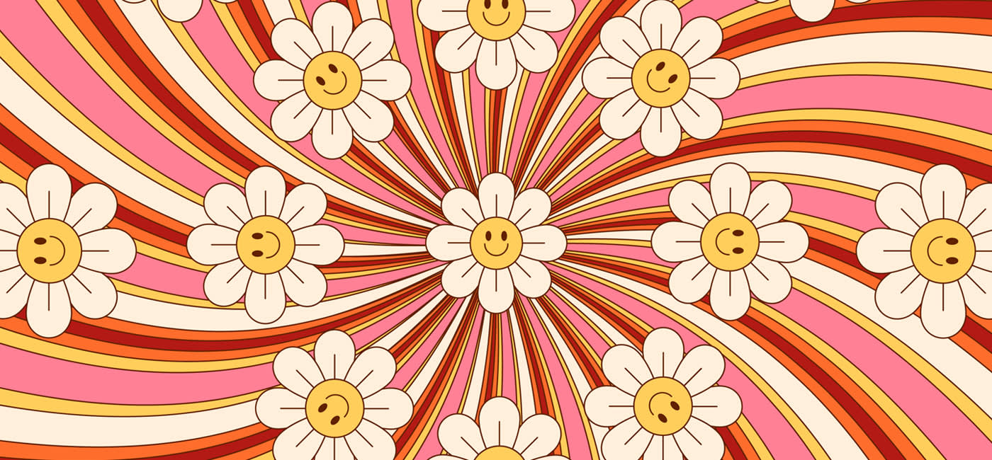
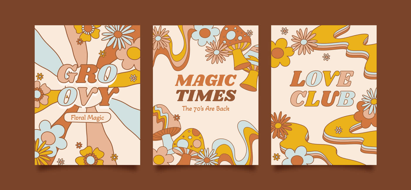
3. Floral pattern
Flowers and floral patterns dominated the designs of the 70s. Although floral designs were already used in the late 60s, they experienced their very big moment in the 70s. Besides floral motifs, paisley patterns and mandalas are also typical for the designs of this era.
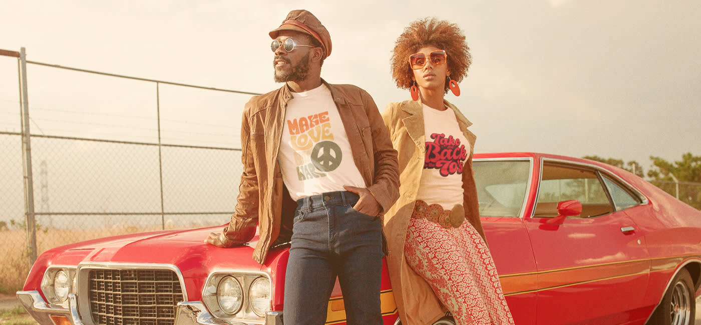
4. Clashing colors
When colors are very similar, we speak of a color clash. On the color wheel, these colors are often close together – or they are particularly similar in brightness. In the designs of the 70s, red, brown, orange and green in particular were often used together. Warm hues such as mustard yellow, burnt orange and other earth colors were quite popular. The fact that nature was a significant source of inspiration in those years was evident in colors like Avocado Green or Harvest Gold.
5. Everyday people in focus
People themselves were at the center of advertising and graphic design well before the 1970s. For the most part, these were perfectly styled models advertising products and services. In the 70s, however, people began to show “real” people with whom everyone could identify. Photographs were mixed with colorful shapes, patterns and typography – but the respective character remained central.
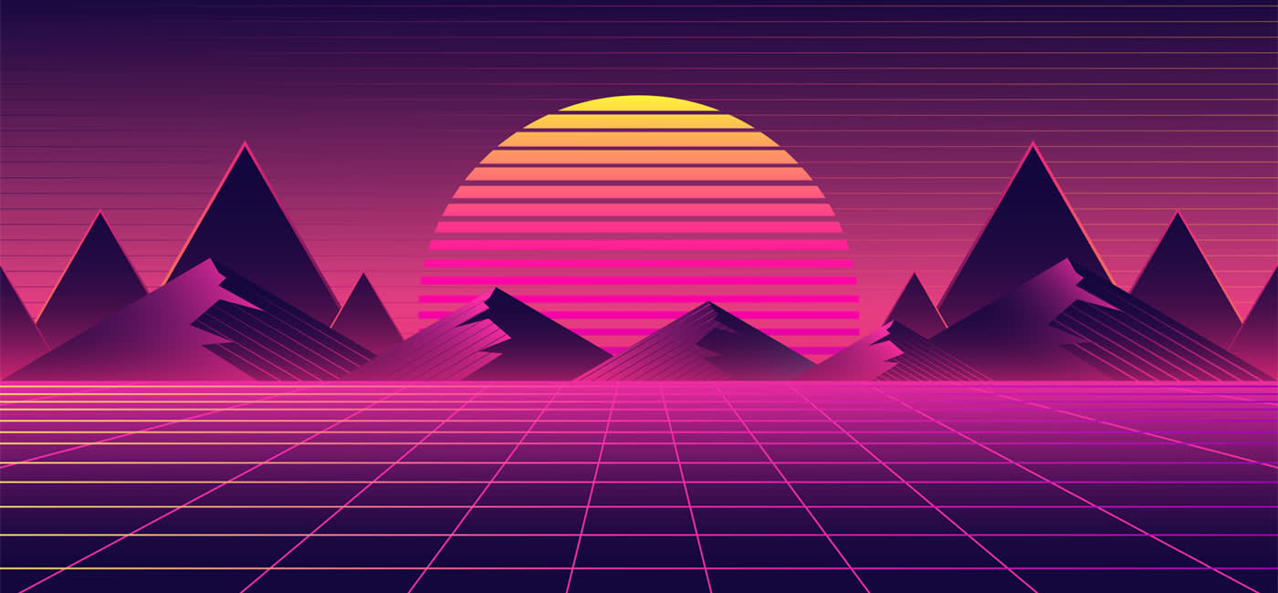
6. Retro futurism
Infinite Space: The ’70s was a decade that focused on futuristic concepts and the aesthetics of space travel. Smooth lines, metallic gradients and symbols of futurism were essential components of graphic design. Imagery from the realms of space exploration, technology and science fiction reflected a fascination with the unknown and an optimistic view of the future.
Just do it: inspiration & tutorials
Time for a little practice? These videos and tutorials show you how to create 70’s style designs, logos, patterns and lettering:
- Design a 70s T-shirt: https://design.tutsplus.com/tutorials/design-and-print-a-70s-style-t-shirt–psd-12484
- Create a 70’s font logo: https://blog.spoongraphics.co.uk/tutorials/create-retro-70s-style-striped-logo-type-effect
- 70’s style pattern: https://youtu.be/nnZiT2pWA9A
- Lettering in the style of Love, Peace & Harmony: https://kellyleighcreates.com/draw-70s-style-lettering-procreate/
More inspiration needed? Our mood board is patiently waiting for your visit. Come on over!
And this is where our little journey through time ends. Can’t wait to get started, but still looking for the right tools? We’ve got something for you! Click through to our article about the basic tools for illustrators.